I’m sure you want to get ahead of your competitors in Sint Maarten. It’s a small island yet competition is fierce. No matter what the industry you are in, whether products or services, everyone seems to be advertising on Facebook and Instagram these days.
Most people simply click the ‘Boost Post” button on one of their posts they feel looks fine and let it go, while others have a plan in place. Which type are you?
To compete at the highest level and win, you need to align a million things like ad creative, copywriting, targeting, landing pages, conversion rates, etc. all while keeping costs down for maximum ROI. For the purpose of this post, i’ll stick to reviewing some of the ads that pop-up in my feed so you can get a feel of what you can improve in your own marketing.
While i’ve chosen sponsored ads, all your posts will benefit if you keep these concepts in mind.
1. Super Optician
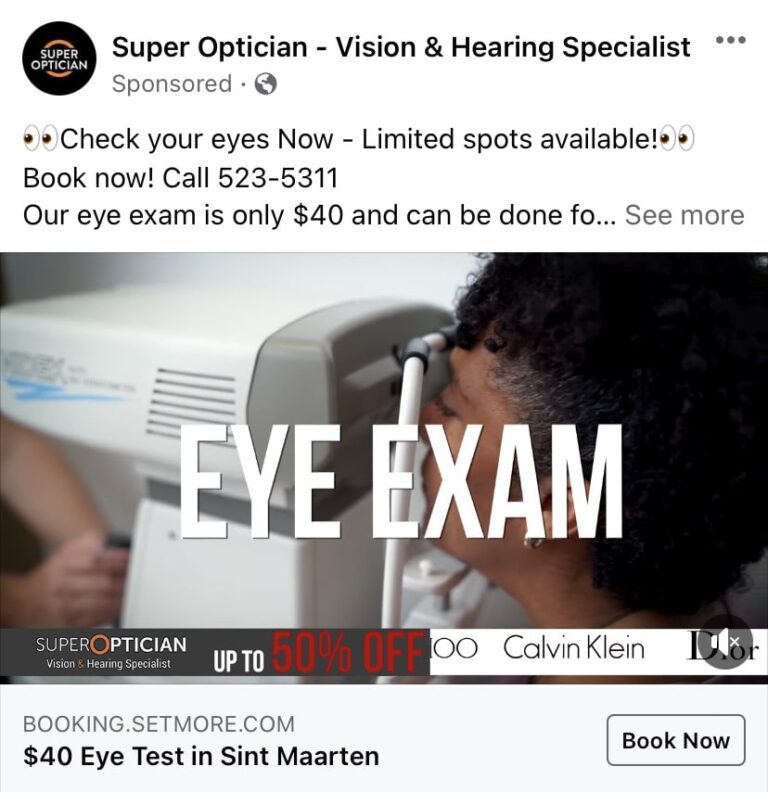
This is a screenshot from a Video Ad format.
The video seems to be professionally taken which is good.
Text – I would put Check your eyes Now for only $40 today.
Limited spots available – While they are trying to add urgency, a viewer knows this is not true. If it was for a product, it’s more believable.
The Headline is clear and to the point.
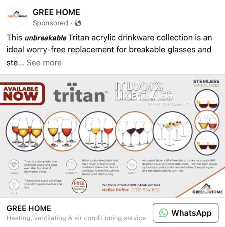
There are 6 different types of glasses being advertised in one image with an explanation in text within the image. This makes it almost impossible to read as there are walls of text and the glass shapes cant be seen clearly because theres simply too many. In this case..Less is more.
It was designed wide which has further limited the space available. If it was square or portrait there would be more breathing space.
The Headline shows Heating, ventilating & air conditioning service. I dont know about you, but I usually dont buy my glasses from the air conditioning company. It should say something like Wine glasses in acrylic, bet you cant tell the difference.
2. Gree Home
3. Vic A.C. Tech
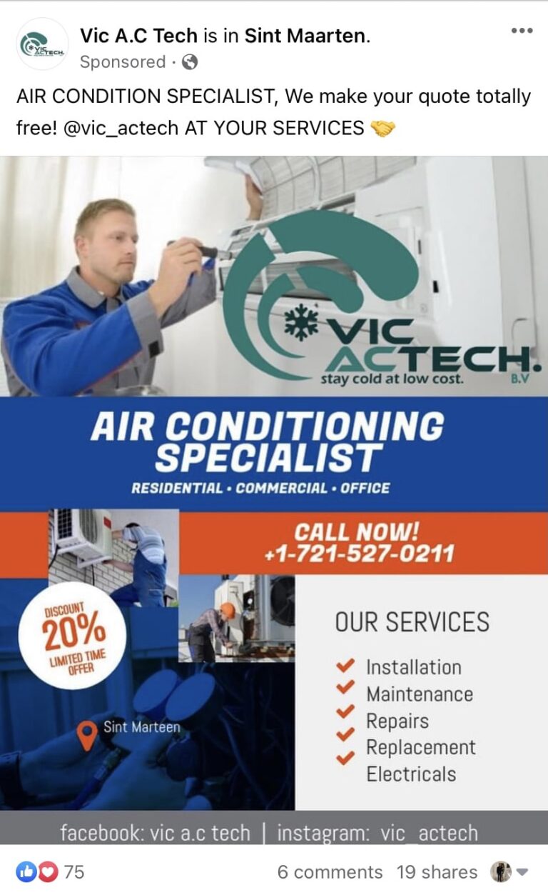
This ad has a good image of someone servicing the a/c, the logo could have been a little smaller as its a little distracting.
The lower half of the image has some images which I cant really make out what it is, too many images crammed there. That space could have been used a little more effectively.
The image could have been a little shorter so we could have read the headline on the same screen.
And another a/c company..
My guess is that this ad does not perform well. The a/c is coming off the wall, thats what it looks like.
The white band cuts the image in two. And, theres no one in that room.
Theres no catch to the ad, except for letting us know this item is available.
Would you contact them if you were looking to buy an a/c?
4. Fujitsu Air Conditioning

5. No Limits Swim Academy

Text – It’s badly formatted, e.g. no space after the full stop and too many spaces before the start of the last sentence.
Start with SUMMER PROMOTION would probably perform better.
Image – Do we need to know the class days in the picture? It would have been better to put this in the text field of the ad and have a striking image to stop scrollers.
The catch – It doesnt specify a promotion price. Its easy to scroll through the ad without stopping.
Imaging – The top half image is blurred out and the bottom half has too many images with only 1 visible clearly. Everyone understands a swim class, we dont need a picture of the actual instructor. An image of say a kid diving into the pool would be more compelling letting parents feel their child will be a good enough swimmer afer this class. Example image is below.
To further niche the ad, it maybe worth trying one ad for adults and one for kids. The total budget can still be kept the same.
It’s missing a headline.

This is a carousel ad with multiple images.
We can understand from the name it has something to do with shipping but it should have a hook / their USP in the first image e.g. Get your packages from the US delivered in 5 days.
Design – Although you cant see the second image completely, it is visible that it doesn’t match the color scheme of the first image.
6. EzzyShip

7. Century 21

Theres no catch why a customer would stop to see just a girls photo. FB / Insta are already full of that.
Image – Could be more catchy or at least have a house in the background, makes it a little more personal. The image quality could also be better.
Text – Would have been better to write something like Properly Specialist Pooja Nandwani can sell your house faster than you can flip pancakes.
No headline – missing an opportunity to attract a customer to connect.
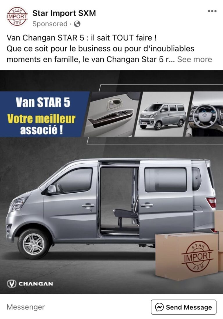
I don’t read French. They should have targeted this ad to only French speaking audiences (that’s an option in the ad settings panel) or use the option to automatically translate your ad to reach people in more languages. Imagine how much of the budget is being wasted if half the viewers cannot read the ad.
Image – The box size is a little larger than ideal, a few more smaller boxes would make it seem like it has a larger storage area. It could have also been more vivid to stop scrollers to sit up and take notice. A contact phone number thats easy to find would be nice.
An idea of the starting price may also be good as this is should be a fairly low cost vehicle (relatively speaking).
8. Star Import SXM
9. Mtech Electrical

Nice complementary color to Facebook’s blue, definitely catches attention.
The images are cut, they could have been square carousel images instead.
The layout is a little distracted, but it works for some people. I would test a cleaner layout and see which performs better.
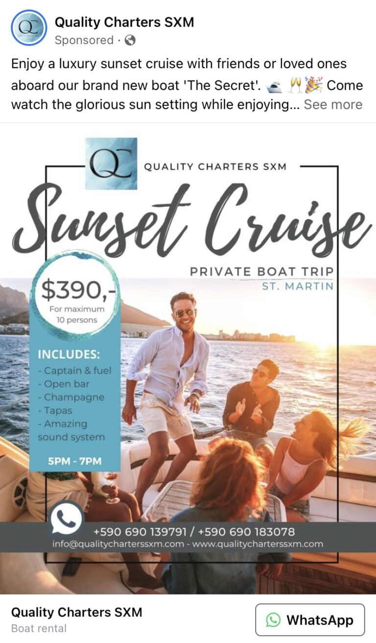
To me, this is a great ad.
Text – well written to make a reader image themselves on a cruise.
Image – Shows a sunset and happy people, exactly what they are offering.
Clear pricing / offer.
Headline clearly mentions what the ad is about.
10. Quality Charters SXM
10 Down, more to come..
These ads were chosen in no particular order, they were the first 10 that showed up on my feed.
If any of the ads are yours, I hope you will incorporate some of the suggestions and make it better, or get a knowledgeable agency to do it for you.
If you would like an ad or posts reviewed (for free), do reach out so I can include it in the next post.
Need a pro to take care of your marketing?
Drop us your number and we’ll have someone reach out right away.
